Format fallback
srcset and sizes
handle resolution switching well, but they cannot choose between entirely different
image formats. AVIF and WebP are both substantially smaller than JPEG at equivalent
visual quality — often 30–50% smaller — but older browsers do not support them.
The <picture> element solves this.
<picture> is a wrapper element containing one or more
<source> elements followed by a mandatory <img>
fallback. The browser evaluates each <source> in document order
and uses the first one it can handle. If none of the sources match, it falls back to
the <img>.
The <img> element at the end is not optional — it is required by
the HTML specification. It carries the alt attribute (the
<source> elements have no alt), the
width and height needed to reserve layout space, and
the universally-supported src fallback format. The
<source> elements only supply candidate URLs; the rendered
image is always the <img>.
Demo: AVIF → WebP → JPEG cascade
List the most efficient format first, then progressively wider-supported formats.
The type attribute on <source> names the MIME type
of the file in srcset. A browser that does not recognise the
type skips to the next <source>.
A browser that supports AVIF (Chrome 85+, Firefox 93+, Safari 16+) downloads the
.avif file. One that supports WebP but not AVIF (most mid-era mobile
browsers) gets the .webp. Everything else gets the .jpg.
All users see the same image; only the format — and therefore the download size —
differs. The fallback strategy is progressive enhancement: serve the best option
available, degrade gracefully.
Art direction
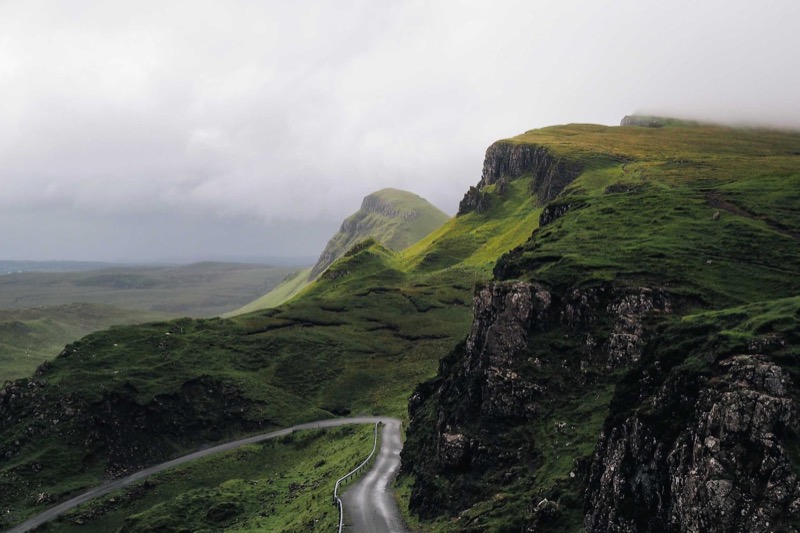
Format fallback is about sending the same image in a better file format. Art direction is different: it is about sending a different image — a different crop, composition, or framing — depending on screen size.
Consider a wide landscape photo. At desktop sizes the panoramic view looks great.
Scaled down to a narrow phone, the scene becomes a tiny, unreadable strip of pixels
where the subject is lost. The better approach for mobile is a tighter portrait crop
that keeps the focal point large in the frame. This is what the media
attribute on <source> enables.
Crucially, the media attribute is a hard switch, not a
hint. Unlike srcset's suggestion-based algorithm (where the browser is
free to pick a cached file or adjust for network conditions), the browser
must respect a media condition. When the condition is true, that
source is used — period.
Demo: landscape on wide screens, portrait crop on narrow screens
Resize your browser window below 600 px to see the swap. On narrow viewports the browser serves the upright portrait crop; on wider viewports it serves the full landscape scene.
The aspect-ratio / CLS trade-off
The width and height attributes on <img>
tell the browser the aspect ratio of the fallback image so it can reserve the correct
amount of vertical space before the file loads. However, width and
height on a <source> inside <picture>
are ignored by browsers (those attributes only apply to <source>
inside <video>).
When art direction swaps in a crop with a different aspect ratio — a 2:3 portrait
replacing a 3:2 landscape — the reserved space does not match the delivered image.
The result is a small layout shift on narrow screens. Preventing it requires extra
CSS, typically an aspect-ratio rule scoped to the breakpoint at which
the crop changes. This is a known trade-off of art direction and worth documenting
when you implement it.
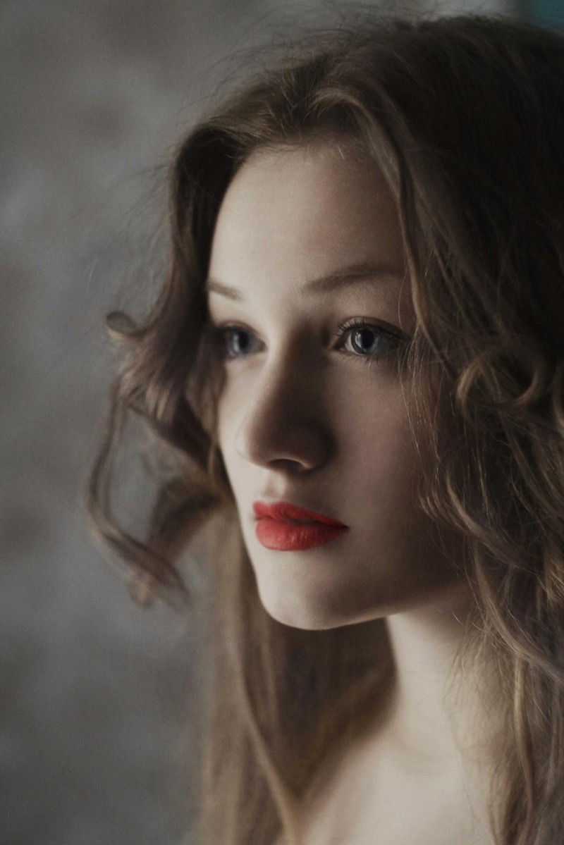
Dark-mode images with prefers-color-scheme
The media attribute on <source> accepts any valid CSS
media query — not just width conditions. One practical use is
prefers-color-scheme: dark, which lets you serve a different image
variant to users who have enabled dark mode.
This is useful when an image has a bright white background that looks harsh in a dark interface, or when you have a logo in two versions (dark-background and light-background). Rather than hiding and showing elements with CSS, you can swap the image file directly in HTML.
Demo: swapping image for dark mode

The demo above uses the portrait crop as a stand-in for a "dark-tuned" variant — in a real project you would supply a version of the same image edited for dark backgrounds (reduced brightness, adjusted contrast, or a version with a transparent background that sits comfortably on dark surfaces). The important point is the mechanism: the browser evaluates the media query at render time and again when the system color scheme changes, so the swap is automatic with no JavaScript required.
Toggle your operating system between light and dark mode while this page is open to see the browser re-evaluate the condition and update the displayed image.
Combining attributes and the source explosion
Each <source> element can carry type,
media, srcset, and sizes all at once.
This composability is powerful — but it multiplies the number of
<source> elements you need very quickly.
Consider a single image that needs: three formats (AVIF, WebP, JPEG) × two sizes
(desktop and mobile crop) × two color schemes (light and dark). That is
3 × 2 × 2 = 12 source variants. Each distinct combination of
type + media requires its own <source>
element. Writing and maintaining this by hand is error-prone — this is the point
at which you reach for a build tool or CDN image transformation pipeline to generate
the markup automatically.
Demo: one combined source (AVIF + sizes + media)

This example covers just two formats, two crops, and a handful of sizes — and
already requires four <source> elements. Add a third format
(JPEG XL) or a dark-mode variant and the count doubles again. At this scale,
handwritten <picture> markup becomes impractical.
The standard industry answer is to offload image delivery to a service that handles format selection and resizing at the CDN level via URL parameters — see 08: Serving & content negotiation for how CDN-based content negotiation can replace much of this markup complexity.