Compress carefully
Compression is the single highest-return optimization available for images. A typical unoptimized photograph dropped into a page is anywhere from 2× to 10× larger than it needs to be. The key insight is that compression decisions stack: you pick the right format, resize to the display size, strip unnecessary metadata, then dial in quality. Getting all four right compounds the savings.
Resize to the displayed size
Serving a 3000-pixel-wide photo on a page where it is displayed at 800 pixels wide
wastes the bandwidth needed to download — and the CPU needed to decode — more than
ten times the pixels the user will ever see. Always resize to match (or be slightly
larger than) the largest display size you expect. For responsive images, you generate
several sizes and use srcset to let the browser pick; see
06: Responsive images.
Strip metadata
JPEG files routinely embed EXIF metadata: GPS coordinates, camera model, date taken, colour profiles, and thumbnail previews. None of that information is displayed by the browser, but it adds kilobytes to every file. Most compression tools strip it automatically; make sure the option is enabled.
Choose the right format
AVIF and WebP compress significantly better than JPEG at equal perceived quality. SVG beats raster formats for logos and icons at any size. For a full format comparison see 05: Choosing a format.
Pick a sensible quality
For lossy formats (JPEG, WebP, AVIF) the quality setting is the main lever. The sweet spot for photographs is usually in the 70–85 range on a 0–100 scale: quality below that becomes visibly blocky; quality above it adds file size without any perceptible improvement. Always compare a compressed image against the original at full size before shipping it.
Tools
- Squoosh (web, free) — drag an image in, choose a format, adjust quality, see a side-by-side comparison with the original, and download the result. The fastest way to explore format and quality trade-offs interactively.
- ImageOptim (Mac app, free) — drag-and-drop batch optimizer; strips metadata and runs lossless optimizers (PNGOUT, Zopfli, MozJPEG) automatically. Zero configuration required.
- Sharp (Node.js library) — the standard choice for build pipelines and servers. Programmatically resize, convert format, and set quality. Used internally by Next.js, Astro, and many other frameworks for their image optimization features.
Sprites
A CSS sprite combines many small images — typically icons — into a
single larger file. You then display only the relevant portion of that file inside
each element by using background-image together with
background-position to offset into the correct cell. The browser makes
one HTTP request instead of one per icon.
How background-position offsets work
Think of the sprite as a grid of cells. To show cell (col, row) you shift the
background left by col × cell-width pixels and up by
row × cell-height pixels — using negative values because you are
moving the image in the opposite direction to reveal the right part.
The sprite used here (sprite.png) is 288×192 px — a 3-column ×
2-row grid, each cell 96×64 px. The six icons are laid out as:
- Row 0: home (col 0), search (col 1), heart (col 2)
- Row 1: star (col 0), sun (col 1), cart (col 2)
To show the search icon (column 1, row 0), offset by
-(1 × 96px) = -96px horizontally and -(0 × 64px) = 0
vertically:
Search icon (column 1, row 0) — background-position: -96px 0:
Cart icon (column 2, row 1) — background-position: -192px -64px:
Data URIs
A data URI encodes a file's bytes directly into a URL string. The browser decodes and renders the image without making a network request at all, because the entire image is already present inside the HTML or CSS.
The format is: data:[<mediatype>][;base64],<data>
For binary formats (PNG, JPEG, GIF, WebP) the data must be Base64-encoded.
For SVG you can use percent-encoding instead — replace # with
%23, < with %3C, and so on — which
avoids the overhead of Base64 and keeps the string shorter.
Trade-offs
- Pro: eliminates the HTTP request entirely — useful for tiny, critical assets that must be available before any external resources load.
- Con: size inflation. Base64 encoding expands binary data by approximately 33%. A 1 KB PNG becomes a ~1.33 KB inline string.
- Con: no independent caching. Inline data URIs are embedded in the HTML document and cached only as part of it. A separately hosted image file can be cached in the browser indefinitely and reused across pages.
- Con: bloats the document. Anything above a few hundred bytes is a poor candidate — it makes the HTML harder to read and slows the initial HTML parse.
Data URIs are a good fit for: tiny loading spinners, critical inline icons that must render before external resources are fetched, and single-pixel tracking placeholders. They are a poor fit for anything else. Cross-link: URLs: Data URIs.
The image below makes zero network requests — its entire source is in the src attribute:
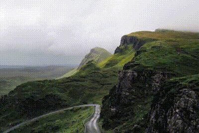
Video instead of animated GIF
Animated GIFs are one of the most persistent performance mistakes on the web. The GIF format was designed in 1987 — its 8-bit, 256-colour palette and lossless frame encoding produce enormous files for anything longer than a second or two. A modern video codec can encode the same animation at a tiny fraction of the size with far better colour fidelity.
Real byte sizes
The clip used in the demo below is the same 400×268 px Ken Burns landscape animation in three formats:
- GIF: 759,040 B (~741 KB)
- MP4 (H.264): 72,313 B (~71 KB) — roughly 10× smaller than the GIF
- WebM (VP9): 25,490 B (~25 KB) — roughly 30× smaller than the GIF
The visual result is indistinguishable to the human eye, and the video versions support full 24-bit colour rather than GIF's 256-colour limit.
Use <video> as a GIF replacement
To make a <video> behave like a GIF — looping silently,
autoplaying, no controls — use four attributes: autoplay,
muted, loop, and playsinline. The last
one is required on iOS to prevent the video from launching the full-screen player.
List WebM first (better compression, supported by Chrome, Edge, Firefox) with MP4
as the fallback (universal support including Safari).
<img> GIF — ~741 KB
Limited to 256 colours, huge file
<video> WebM/MP4 — WebM ~25 KB · MP4 ~71 KB
~30× / ~10× smaller; full colour